

Interview with Cassie Merrick, King & McGaw, March 2026
Q: When did you know that you wanted to begin a career in Graphic Design, was there a defining moment?
I left school with one qualification (Art O Level) and had no idea what to do. My Mum encouraged me to continue drawing as she saw that it was something that brought me joy. I got on a basic CPVE craft course at Southport College of Art and spent the year revising and retaking English and Maths which allowed me to enrol on a BTEC Graphic Design course and from there I’ve been riding the wave ever since.
The defining moment was seeing the original 8vo artwork for the Durutti Column’s ‘Guitar & Other Machine’s’ record sleeve at an exhibition in Manchester called ‘Sublime’, 1992. In that moment I realised that the Swiss Graphic Design approach that I’d had drilled into me at college could be interpreted in my own way.
Q: Your iconic typography decorated the covers of alternative music magazines, Blah Blah Blah and Ray Gun in the 1990s – an amazing moment in time for alternative music. Were you painting directly over the cover photography to create the interactive feel of the design? And who were your favourite musicians that you were able to collaborate with in this way?
The cover typography was always created by hand on paper, sometimes as lots of different elements and then scanned in and dropped over top of the photography - the serendipity of not exactly knowing where or how the elements would combine was the thrill of it all.
Whilst at Ray Gun magazine I would meet various musicians and artists who would stop by the office. One day Michael Stipe from REM walked into my design room and started talking to me about the magazine layouts I was working on. We hit it off straight away - he’s quite quiet and introverted (like me).
He’d studied photography at art school before getting into music and had just finished documenting his hero Patti Smith on tour - he showed me a cardboard box full of wonderful black and white photographs that needed putting into a book. I ended up staying at his farm for a week in Athens, Georgia - we’d paginate the photographs on his kitchen floor and then when that was wrapped I went back to LA and designed the book (2 x Intro: On the Road with Patti Smith, Published by Little Brown).
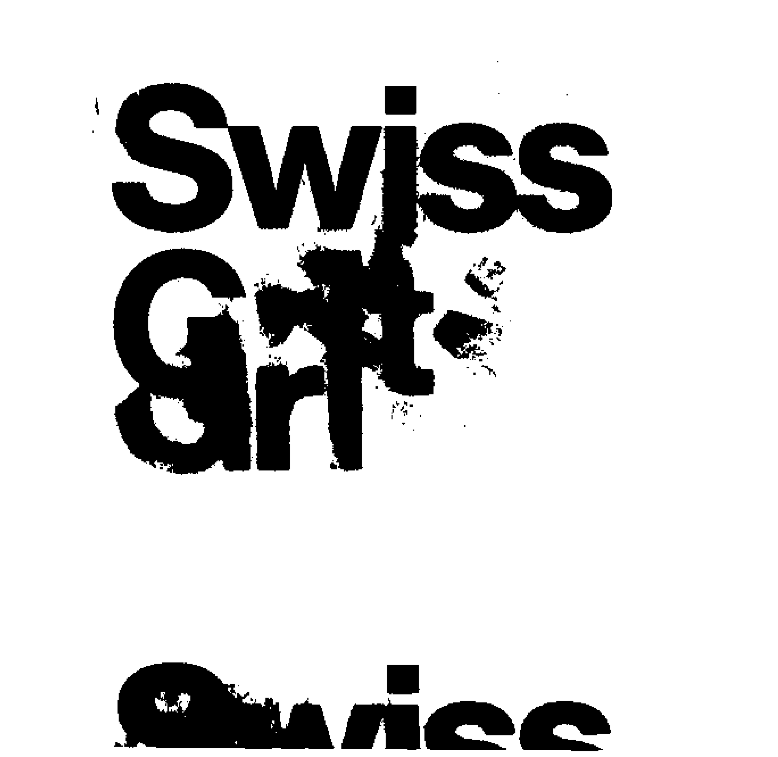
Q: Tell us about Swiss Grit?
It’s the fusion of two things. The former being the design principles of the 50s/60s Swiss International Graphic Design School involving sans serif type, negative space, precision, balance and grids which I was taught during my 4 years at Design School. The latter is what I call the visual language of the street - posters, signage etc that we see everyday and in particular the way it degrades and takes on a life of it’s own after succumbing to the sun, rainfall and human interaction.
Over the years both of these big influences have developed into a creative approach I call ‘Swiss Grit’ which is essentially Swiss graphic design with a unique soul.
Q: Do you feel that there is enough being done to regulate the use of AI in the graphic design industry?
NO.
Q: There’s something very instinctive, literal and natural about the way your designs interpret lyrics. Using your handmade approach, you have collaborated with bands such as Bush and New Order to produce album artwork and posters. How was the experience working on these projects?
I’ve been extremely fortunate to have been given the chance to work with New Order, Bush, Robbie Roberston and Michael Stipe. My biggest common takeaway from each of these experiences is that they trusted me and wanted me to bring my own creativity to their projects without any external interference. Much like they operate in their musical worlds. A totally different experience to working on big tech projects for Microsoft!
Q. Alongside your projects that have become fused with music, you also have an incredibly strong portfolio working with companies including Nike and Microsoft as a brand consultant. How do these projects differ?
As I’ve already alluded to - with music and pop-culture brand projects (incl Nike) I give an instinctive, intuitive response to what I’m working on. With big corporate projects for brands like Microsoft, Nokia or Abbott I ultimately deliver a strategically deliberate response based on a particular set of inputs…target audience, key message and success metrics etc. Neither is better or the correct way of working in my opinion but there are different needs, and goals at play.
Q: Working with K&M, you have released two limited edition screen prints. What can you tell us about these artworks?
I’ve been making what I call ‘Sound in Print’ artworks for about 10 years now - just me putting on the headphones, playing a song and creating a piece of artwork by hand in response to what I’m hearing and feeling.
With these two limited edition screen prints I wanted to create them in a similar analog and handmade way but I was looking for an idea that would elevate them above a song, and towards a genre of music - genres that have been my favourite musical moments of my life.
Q: Is it important for you to produce art everyday?
Absolutely. It took me a long time to realise why I need to create everyday. It’s my mental happy place. Some people go for a run. Some game. Some cook. I stick bits of paper to other bits of paper and I love it.
Q: Do you have any upcoming projects that you can share with us, or any dream music collaborations?
I’m working on a new issue of MARVIN magazine with my old Ray Gun publishing friend Marvin Scott Jarrett which is a thrill. The magazine is oversized A3 format and is unbound - so I get to design 44 x A2 spreads featuring new music and fashion.
I’ve also just finished a big handmade design commission for EA Sports in San Francisco which will be out in the summer.
Dream music collaborations…there’s only one and they’re from Basildon, Essex.